Storytelling through Visual Design: Interview with Brennen Birch and Zach Ramos of the School of Visual Concepts
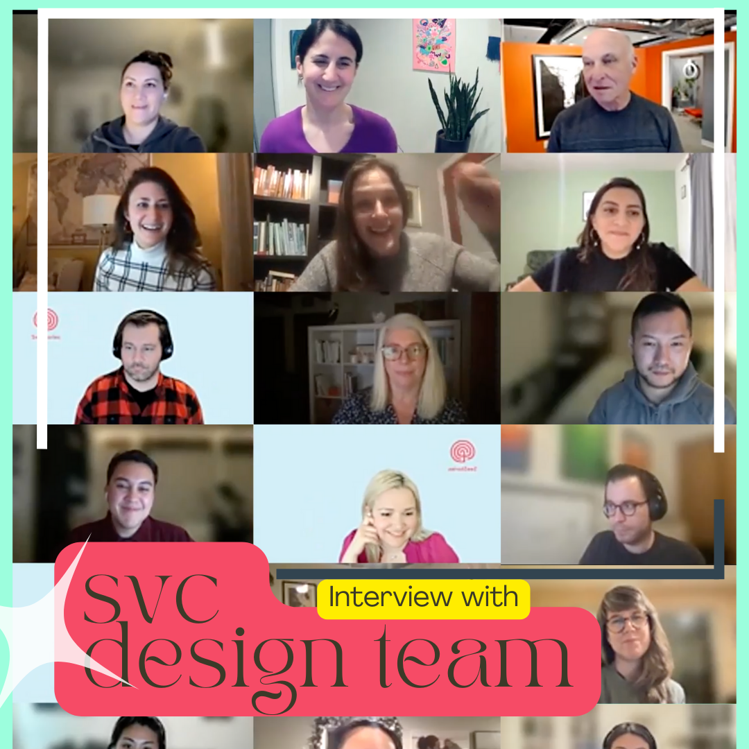
This week we are featuring a special interview of some students from The School of Visual Concepts based in Seattle. The students from The School of Visual Concepts used our website redesign project as a “capstone” project, where they interviewed dozens of students, teachers, staff, and board members affiliated with See Stories to better understand us as a nonprofit and figuring out our website needs. Each team created two separate prototypes for Social Good Studio to use in the redesign of our website that you see today! We are grateful to The School of Visual Concepts and the students that helped design our new website.
The art of storytelling can be expressed in many different ways. When most people think of storytelling they picture the oral or written communication of a tale, one with a clear beginning, middle, and end. While these elements do contribute to a story, it is many aspects that create the full scope of a storytelling experience. One such aspect is visual design.

When UX Design first began working on redesigning the See Stories website, the color palette of the website was not in the original plan to be rethought. It was through unearthing the story behind See Stories that one UX Design team member was inspired to add to the organization’s story through color design. “We felt they needed a youthful color palette for a youthful brand,” explained Brennen Birch, a member of the UX Design See Stories team. Part of his role on the See Stories project became creating a color palette that enhances the stories told in that palette.
Not only is matching the background to the stories told on it important, the color palette of the See Stories online presence also had to be changed for a modernized and more accessible form of the organization. Lacking contrast in colors becomes an accessibility issue as stories are spread between people with differing abilities. “If you put too similar of colors next to each other it is hard to read, especially for people with low vision or who are color blind,” Brennen explained, “we tried to make it easier to create compelling and vibrant content accessible.”
The easy to interpret and vibrant colors do more than provide a background to See Stories’ projects, however. They tell their own story. To create the color palette, Brennan, a one-time Alaskan visitor in awe of the great state, took inspiration from photos taken across Alaska. Drawing from contemporary Alaskan photographers sourced through the Anchorage Museum, Brennen was able to create a color palette with its own story based in the 49th state.
“Baby blue and black come from spruce trees and snow.
Vibrant green comes from aurora borealis.
Blue comes from another way that snow might look- in the Yukon.
I’ve been to Alaska once and I remember in June the dandelions were everywhere. I thought dandelion yellow would be a great addition to represent urban settings.
Of course, salmon pink is an essential part of Alaskan culture.”

Telling the story of Alaska, the home of many of See Stories’s own projects and impactful work, is a large part of the “new look” to the See Stories online presence. It is thanks to designers like Brennen that that story gets translated across more contexts than just words. “See Stories is an organization that helps other people tell their stories, our work as designers was to help See Stories tell their own.”
Working on the new format and backdrop for See Stories’s own programs and news, Zach Ramos cites Alaska as an inspiration in his own artistic work and design. “Alaska is a huge part of everything I do artistically. Just growing up and being (in) Alaska there is so much beauty around you.”
Currently based in Seattle, Zach was able to reconnect with Alaska through See Stories. His hometown of Fairbanks and childhood camping and village trip endeavors are reflected in his artistic work. From illustration and watercolor to photography and graphic design, Zach finds storytelling in creating art. This is why the work in redesigning the See Stories website is so important, it conveys a story.
Working with three other designers, Zach’s role was mainly in the interaction design phase, including creating a new webpage layout and user tools. Making See Stories more accessible and a more compelling source for stories was not the only goal of Zach and the rest of the team, however.

“We worked as a team to learn everything we could about See Stories, their impact and work. By speaking with board members we got a sense of what was important and needed public attention. Our goal was to make sure their mission was represented on the website, and that it was easy to navigate and find for educators.” The purpose of See Stories, to share Alaskan stories and voices and empower people to create room for their own, is one that magnetizes to the forces of other stories and storytelling.
Having lived in Seattle for a few years, Zach isn’t too removed from Alaska. Still, he found it serendipitous to work with an Alaskan organization and give back to the Alaskan community. “It’s an impactful mission, I was inspired to work on the project.”
Telling the story of Alaska, the home of many of See Stories’s own projects and impactful work, is a large part of the “new look” to the See Stories online presence. It is thanks to designers like Brennan and Zach that this story gets translated across more contexts than just words. “See Stories is an organization that helps other people tell their stories, our work as designers was to help See Stories tell their own.”
